Note: This article applies to the Adventist design. Therefore it is currently not available for the Hope Channel design.
Overview
A transparent header on the website allows one to use a banner image the complete width of the website header. In choosing the banner image, the website editor needs to consider the color of the image and the color of menu items. If the background image is not properly chosen, the color of the image may render the menu navigation links "invisible".
These notes demonstrate how to configure a page (or entire site) to use the transparent header., so that the navigation elements appear on the header background image and not a colored background. This is mainly used for the Adventist design.

How to
- Click on the Web module to expand it.
- Expand the website.
- Click on the Layouts submodule.
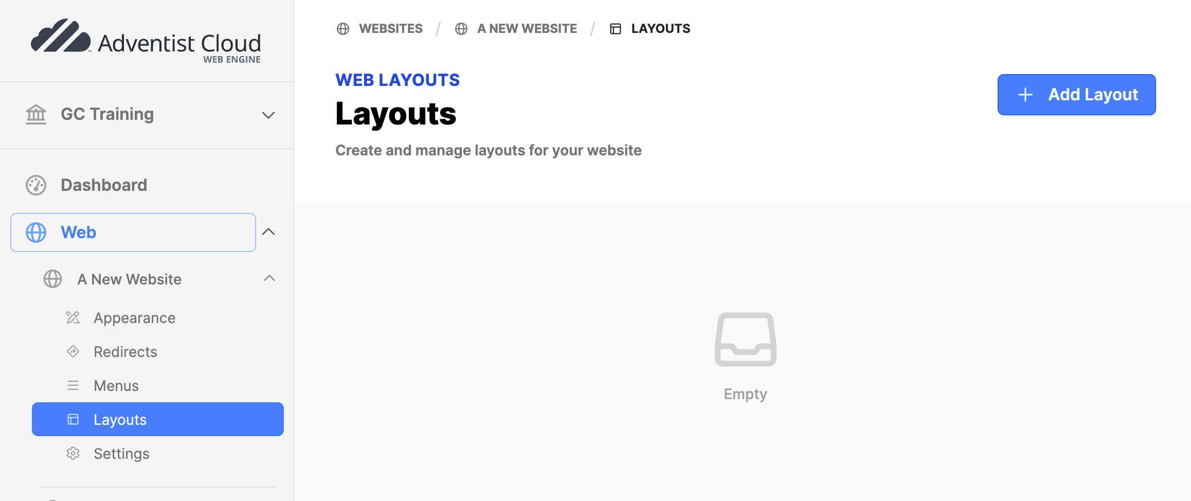
- Click on the Add Layout button.
- In the Layout Manager add the following:
- Name: Transparent Header
- Collapse header: Set checkmark.
- Click the Create button.
- The screen will refresh. Click on the title Transparent Header.
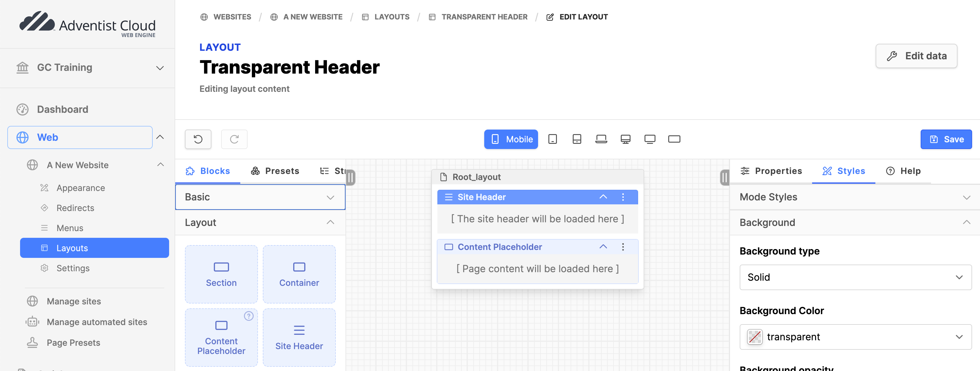
- Edit the empty layout:
- Under the Layout section of Blocks, drag and drop the block Site Header on the page.
- Click on the Site Header block.
- Under the Styles tab on the right column: Background type = Solid.
- Background color: transparent.
- Drag and drop the Content Placeholder block on the page below Site Header block (no settings needed).
- Click the Save button on the upper right.
Appearance (whole website)
- ONLY follow these steps, if you are making the transparent header the default for the entire website.
- Click on the Web module to expand it.
- Expand the website.
- Click on the Appearance submodule.
- On the Design tab, Design section, set the Default layout to the new Layout created.
- Click on the Update button.
- Using this option, you can skip Page settings below
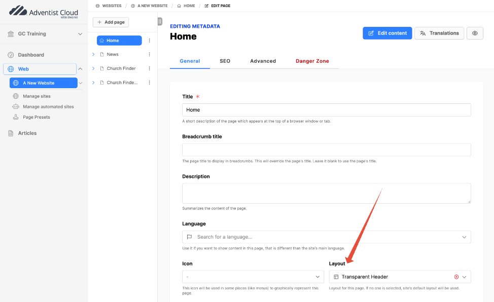
Page settings (individual pages)
- Use this option, if applying the layout to individual pages. (This is the usual case, depending on your design.)
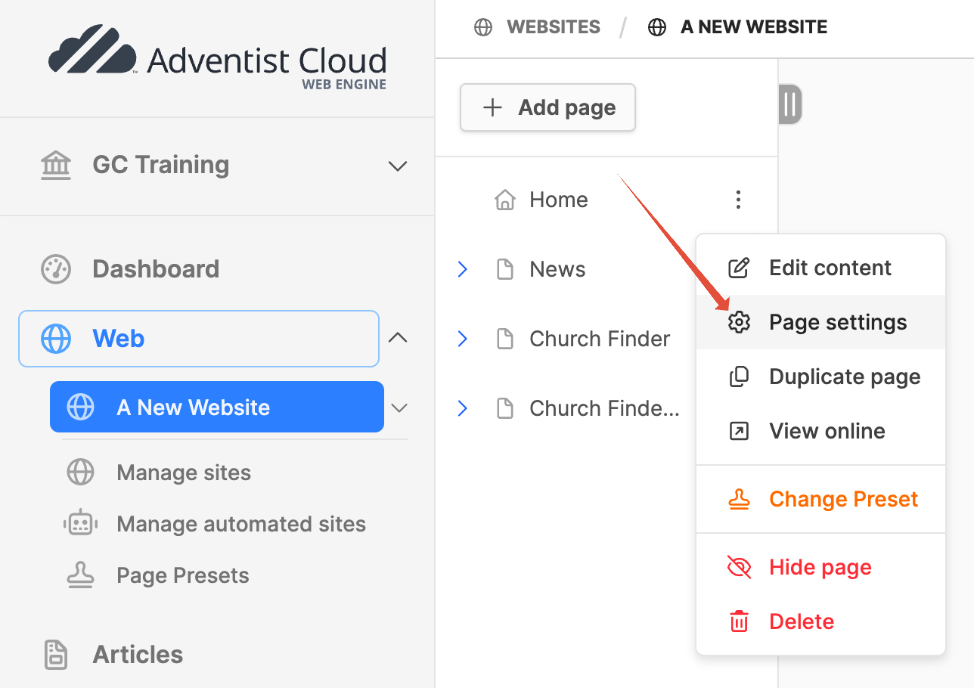
- Click on the website name to open the page tree.
- Choose a page that should have a transparent header and click on the menu icon (3 dots).
- Click on Page settings.
- Go to the General tab.
- Scroll down to the Layout field, select the Transparent Header layout you just made.
- Click on the Update button.
Page Content
- Under the Layout section of Blocks, drag and drop a Section block onto the page itself. On the right column, under the Properties tab / Advanced / Name: Header.
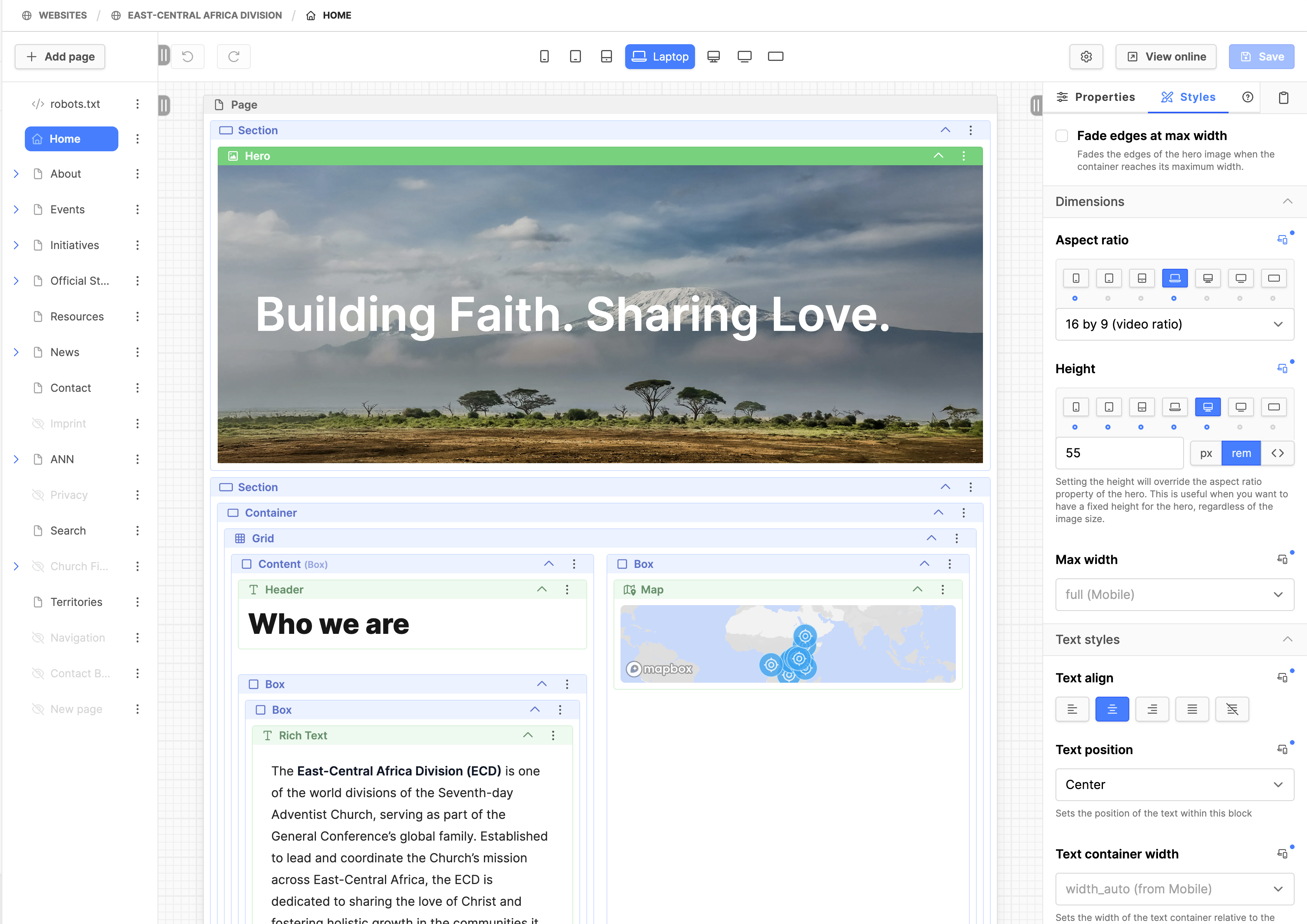
- Under the Components section of Blocks, drag and drop a Hero block into the Section.
- Click on the Hero block. On the right column, under the Properties tab: add an Image, Title, Description text, Call to Action, Name, as needed.
- Note: The Call to Action URL is accessed by the small gear icon. Click on that to adjust the CTA settings.
- Click the Save button on the upper right.
- Click on the Hero block again. On the right column, under the Styles tab:
- Expand the Dimensions. The Aspect ratio may need to be set by clicking on the small icon to the right, depending on the image.
- 1:1 for mobile
- 16:9 for laptop
- Set the Height: It's a responsive field, as the value typically varies based on the breakpoint.
- Suggested settings by clicking on the small icon to the right:
- Mobile: 25 rem
- Phablet: 30 rem
- Tablet: 34 rem
- Laptop: 38 rem
- Desktop: 55 rem
- These settings may need to be slightly altered depending on your configuration.
- Consider incrementing at 5 rem intervals at each breakpoint until largest needed height.
- Expand the Dimensions. The Aspect ratio may need to be set by clicking on the small icon to the right, depending on the image.
- As needed, adjust Text align, position, color, background type, gradient type as the picture dictates.
- Click the Save button on the upper right.
- View in frontend to check, adjust if needed.